Filter Your Results
Category:
- flash
- flash programming
- design
- blog
- DIY
- database
- cooking
- application
- social
- self-promotion
- wireframes
- teen
- women
- men
- kids
- cd-rom
- character development
- music
- CMS
- viral
- fashion
- scifi
- fantasy
- footwear
- ecommerce
- film
- celebrity
- documentary
- magazine
- editorial
- theater
- non-profit
- reality
- video
- home
- banner
- animation
- game
- television
- software
- government
- military
- retro
- medical
- educational
- shopping
- consulting
- strategy
- advertising
- featured
- comic
- museum
- illustration
- photography
- squarespace
* Click to add tag
Buy A Rock Archive URL


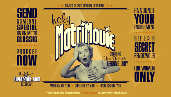
Buy A Rock — View Client
1998 IDENTITY, MERCHANDISE, PRINT, TV, WEB
Online shop for purchasing engagement rings. Included a shopping cart, educational presentations and interactive elements making the site entertaining, useful and educational.
chopshopstore.com Live URL

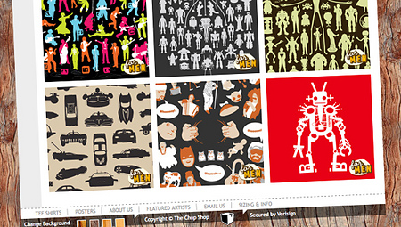
Chop Shop — View Client
2004 IDENTITY, MERCHANDISE, PRINT, TECHNOLOGY, WEB
The Chop Shop Store is the eCommerce wing of the Chopping Block. It was created as a place where Chopping Block designers could showcase and sell their work on tshirts, posters and other printed goodies.
The Chopping block wanted a site that showcased our beautiful, cleaver and funny products in an unusual and distinctive way that was still intuitive for the user. The Chopping Block designed, wired and built the site to be a fully functional eCommerce experience.
Chop Shop Merch Live URL
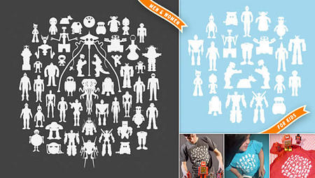
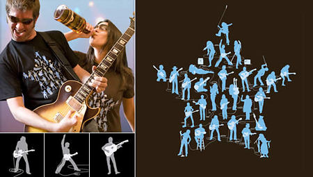


Chop Shop — View Client
2004 IDENTITY, MERCHANDISE, PRINT
Chop Shop is the eCommerce side of all things Chopping Block. Its main product tends to be tshirts, but more goodies are planned for the coming years.
Chop Shop’s main source of inspiration are all things nerdy or geeky. However, that definition has broad interpretations and is defined by the obsessive nature of our culture rather than simply appealing to math and programing nerds. For us, you're a geek if you can recite all the Beatles albums in chronological order as well as if you know the difference between actionscript and javascript.
Our initial line of products focused on the "designerd" community and even carried a tshirt with “designerd” emblazoned across it in script. Later, Chop Shop struck pay-dirt with its “weRobot” celebrity robots tshirt which was featured on blogs from boingboing.net to your Uncle’s family blog. The silhouette concept has branched out to rock stars, fantasy and more.
Chop Scouts Live URL

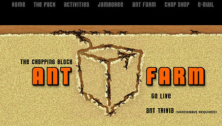
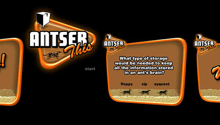
Chopping Block — View Client
1997 IDENTITY, WEB
A long time ago, The Chopping Block's marketing strategy was one of identity crisis. The Chopping Block would intentionally re-skin and re-brand the HTML site in the name of creativity every few months. With this particular iteration, The Chopping Block ceased to be a design studio and became a rag-tag troop of Boy Scouts.
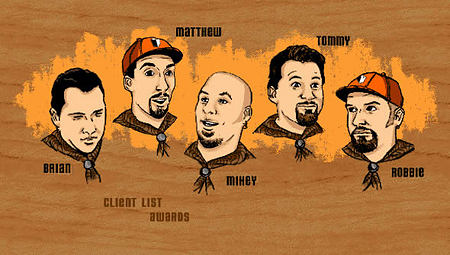
At this time, The Chopping Block consisted of Thomas Romer, Matthew Richmond, Robert Reed and Mike Essl and a single employee Brian Romero.
Jewcy Archive URL


Jewcy — View Client
2006 IDENTITY, WEB
Jewcy is an online media outlet/blog focusing on Jewishness and helping Jews and their peers expand the meaning of community by presenting a spectrum of voices, content, and discussion. Chopping Block developed their logo and identity as well as the overall site.
Lexar Image Recovery
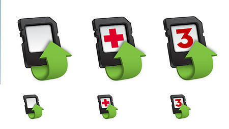

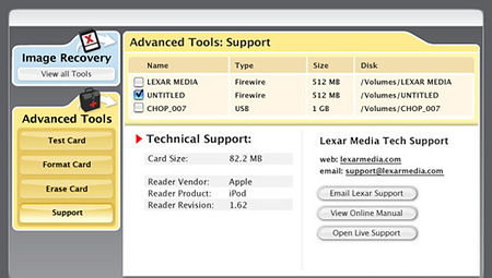
Lexar — View Client
2007 IDENTITY, MERCHANDISE, TECHNOLOGY
Lexar’s Image Recovery software needed an identity from the ground up and asked The Chopping Block to build an entire visual package from splash to error page and from icon to logo. Additionally, The Chopping Block built and wired the visual “front end” of the interface to the more technical “back end”.
Mischen Archive URL
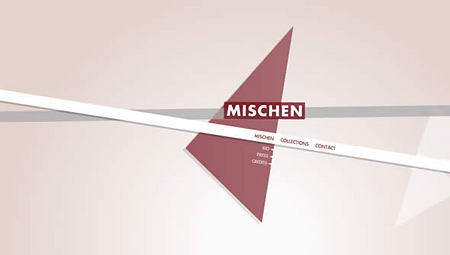
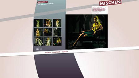
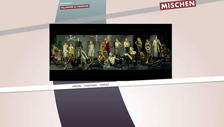
Mischen — View Client
2006 IDENTITY, WEB
Mischen came to The Chopping Block for a simple and elegant flash presentation of their 2006 collections which would also become their official home page.
The home page consisted of 3 randomly generated and placed geometric shapes, intersected by a single thick stripe which their logo sat atop. The look of the splash says high fashion in its simplicity and elegance.
The collections pages exhibited the work in both a standard, yet imaginative interactive gallery. The usual dash of thumbnails is flanked by the expected large scale presentation to its right. The difference comes in rolling over the presentation scale image which then zooms in and pans around the image as the user moves their mouse. Allowing the finer details of the product itself to be observed in an intuitive way.
Movement Studios Website Archive URL
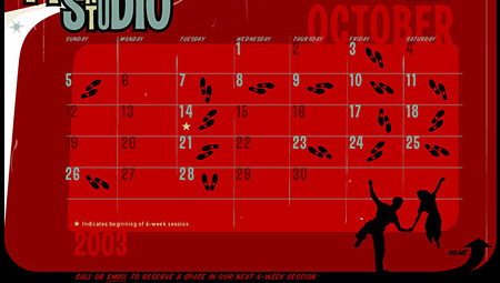
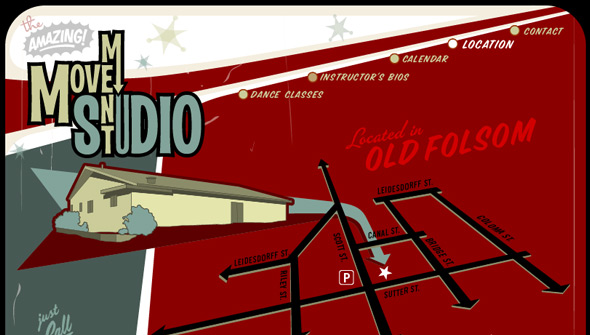
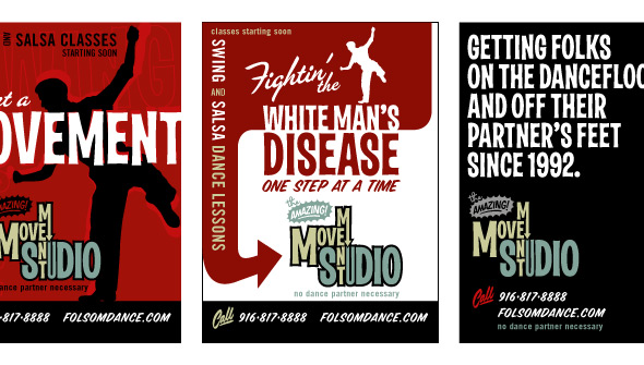
Movement Studios — View Client
IDENTITY, PRINT, WEB
Movement Studios is a studio specializing in swing and other forms of dance. The design is retro 50’s or early 60’s in style to give it a swing era feel. It is simple and is a great example of what Flash can do on a smaller sized budget.
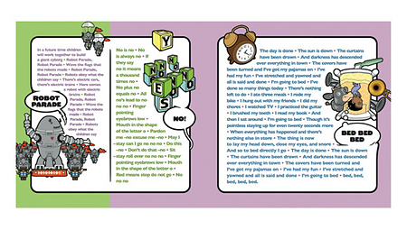
No! Interactive CD/ROM Archive URL
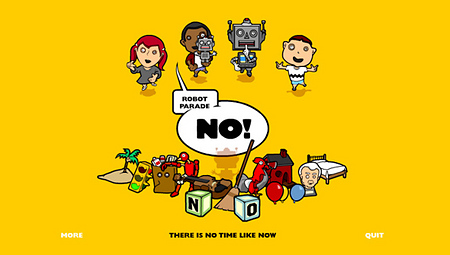

They Might Be Giants — View Client
2002 DISC, IDENTITY, PRINT, TECHNOLOGY
“No!” was the first album by They Might Be Giants specifically geared for children. Chopping Block created the entire identity and a whole imaginary world for “No!” to exist in. In addition to that work, the interactive portion of the project was also designed, programmed and fully conceptualized by The Chopping Block.
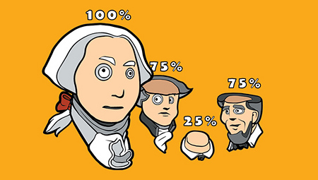
14 of the CDs 18 songs were fully animated and most had an interactive component. In keeping with They Might Be Giants bizarre world-view, the interactive parts stay true to what is happening in the lyrics. For example, in “Fibber Island” a real house and dog become a house made of pie with the dog two-miles wide. Perhaps the key moment on the disc is when the user is able to sort through quarter segments of George Washington’s head which culminates in four segmented presidential heads of Mount Rushmore in “Violin”.
No! Cd Case
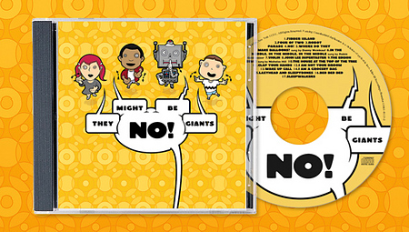
They Might Be Giants — View Client
2002 DISC, IDENTITY, PRINT, TECHNOLOGY
“No!” was the first album by They Might Be Giants specifically geared for children. The Chopping Block created the entire identity and a whole imaginary world for “No!” to exist in. The print material was actually based upon the creative work executed for the interactive CD/ROM included on the disc. Most of the illustrations that adorn the booklet along with the lyrics are re-drawn scenes from the interactive portion of the project also designed, programmed and conceptualized by The Chopping Block.
Ubiq Life Live URL


Ubiq — View Client
2007 IDENTITY, WEB
Engaging flash interactive homepage followed by an elegant straight-forward e-commerce solution.
The design is intended for a high-end, tech savvy audience already used to being dazzled by a slick presentation. Chopping Block delivered all that plus a beautiful way to display featured products right on the front page that cycle through at a display window scale.
Additionally, Chopping Block helped establish an identity for the shop based upon some of the architectural details of the interior of their physical space. An overall look with a vast amount of potential to expand to their overall brand.
Dilbert Identity Live URL

United Media — View Client
2010 IDENTITY, PRINT
Finally, the original icon of office humor will finally have an official logo for all his TPS reports. Working in cooperation with the creator Scott Adams and United Media, The Chopping Block developed the new look for the legendary comic to help establish a brand beyond the well known characters of the strip. As if the Sunday comic pages were not enough, the new identity will start appearing across a large variety of Dilbert merchandise from calendars to mugs to pretty much anything you can imagine a logo could fit on.